Responsive Picture Block
Different images per screen size
outputs semantic HTML
Overview
The easiest way to do real art direction in WordPress. Pick different images for Desktop, Tablet, Mobile (or your own breakpoints) and output a single, clean <picture>.
One wrapper block, multiple Image blocks (Desktop/Tablet/Mobile/Custom)
Outputs a single, semantic
<picture>on the front endTrue art direction: different crops, ratios, or formats by breakpoint
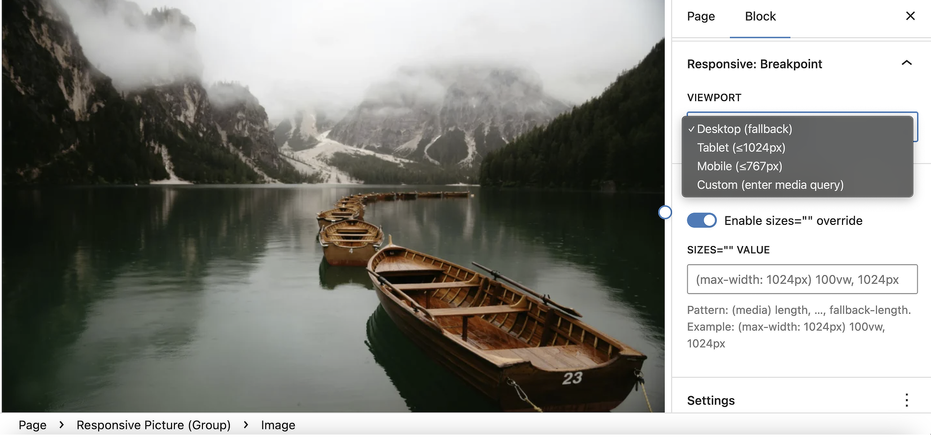
Custom
mediaqueries (auto-sorted for correct source priority)Optional per-source
sizes=""override for bandwidth tuningRespects Image controls: width, height, aspect-ratio, object-fit
Mirrors link & caption from the Desktop image
Editor previews follow the Device switcher (Desktop/Tablet/Mobile)
AVIF/WebP with PNG/JPEG fallback (add
typefor best results)Accessibility:
alttext preserved, clean<figure>/<figcaption>Performance friendly: no front-end JavaScript
Specs
wordpress 6.2+
1.1.1
March, 12, 2026
GPLv2 or later
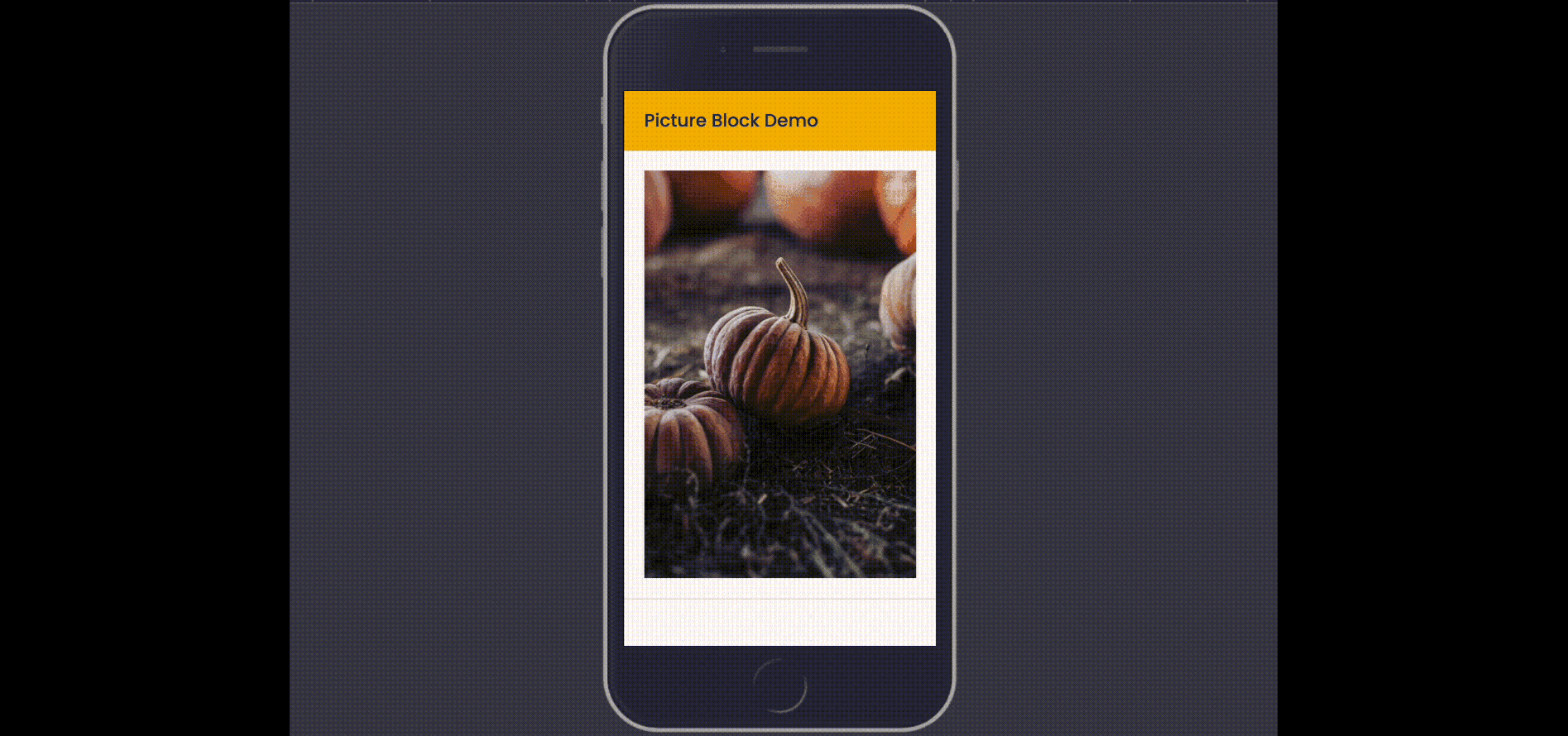
How it works (30 seconds)
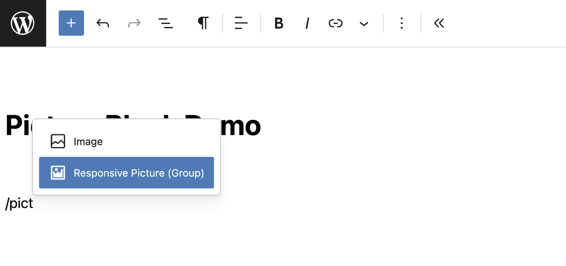
- Add the Responsive Picture Block block.
- Inside it, add one Image for each breakpoint you need.
- For Tablet/Mobile/Custom, you can set or override the media query.
- Publish. The front end renders one
<picture>with ordered<source>tags and a fallback<img>.
Compared to the default Image block
Image Block (core)
- Great at responsive resolution (
srcset) - One image source
- No art direction switching
Responsive Picture Block
- Switches entire sources by
media - Different crops/ratios/formats per breakpoint
- Still uses
srcsetinside each source
Why art direction needs the <picture> HTML element?
srcset is great for picking the right resolution of the same image. But when your phone layout needs a tight crop and your desktop layout needs a wide scene, that’s art direction. The <picture> element lets the browser switch entire sources by media (and even by type like AVIF/WebP), not just widths.
<picture>
  <source media="(max-width: 767px)" srcset="mobile.webp 768w, [email protected] 1536w" sizes="100vw">
  <source media="(max-width: 1024px)" srcset="tablet.webp 1024w, [email protected] 2048w" sizes="100vw">
  <img src="desktop.jpg"
       srcset="desktop-1024.jpg 1024w, desktop-1536.jpg 1536w"
       sizes="(max-width: 1024px) 100vw, 1024px"
       alt="Beautiful landscape">
</picture>
Our block builds this exact HTML for you without you needing to touch your theme.
Pricing
Free
All free features
One wrapper block, multiple Image blocks (Desktop/Tablet/Mobile/Custom)
Outputs a single, semantic
<picture>on the front endTrue art direction: different crops, ratios, or formats by breakpoint
Custom
mediaqueries (auto-sorted for correct source priority)Optional per-source
sizes=""override for bandwidth tuningRespects Image controls: width, height, aspect-ratio, object-fit
Mirrors link & caption from the Desktop image
Editor previews follow the Device switcher (Desktop/Tablet/Mobile)
AVIF/WebP with PNG/JPEG fallback (add
typefor best results)Accessibility:
alttext preserved, clean<figure>/<figcaption>Performance friendly: no front-end JavaScript
Screenshots
Frequently Asked Questions
Will this slow my site down?
Only the image for the device used is loaded, multiple images per block are loaded with other methods (block hiding per size etc).
No front-end JavaScript. The HTML is minimal and leverages native browser decisions for speed.
Does this replace srcset?
No. Each source (and the fallback <img>) still uses WordPress’ responsive srcset. This block adds art direction by swapping entire sources via media.
Can I set custom breakpoints?
Yes. Add “Custom” Images with your own media queries. We auto-sort them so the correct source wins.
What about AVIF/WebP?
Works great. Upload AVIF/WebP and keep a JPEG/PNG fallback in the Desktop image. Add a type on sources for best support.
Accessibility?
Alt text is preserved on the fallback <img>, captions use semantic <figcaption>, and the wrapper never overflows.
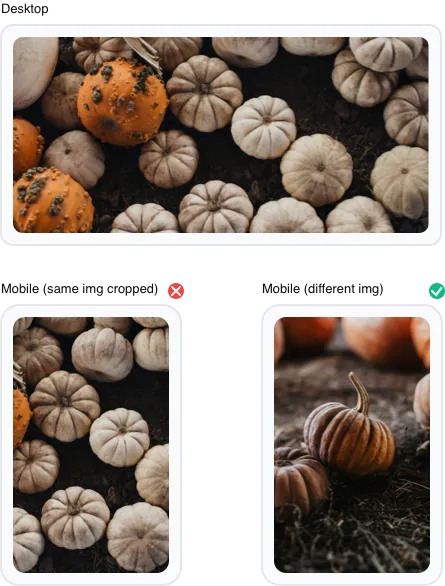
Why should I use this (what is art direction)?
This block allows different images to be displayed based on device size, pixel density, or other media queries (landscape / portrait etc).
This enables art direction by letting you dictate specific, cropped, or altered image versions to better fit various viewports, rather than just scaling a single image.
Does it work with Synced Patterns and Overrides?
As of version 1.1.0, the Responsive Picture Block fully supports WordPress Synced Patterns with Overrides. You can:
- Create a synced pattern containing a Responsive Picture Block
- Enable overrides on the Desktop, Tablet, and Mobile images
- Use the pattern across multiple pages
- Replace images on each page using the standard “Replace” feature
Each page will display different images while maintaining the same responsive structure and design. The Block Bindings API handles all image attributes (id, url, alt, caption) automatically.
Need Support?
Have a question or need help with Responsive Picture Block? Our team is here to assist you.
Contact SupportHave an Idea?
Got a suggestion for a new feature or an improvement for Responsive Picture Block? We'd love to hear it!
Suggest a Feature